My role: UX/UI Design, Project Lead
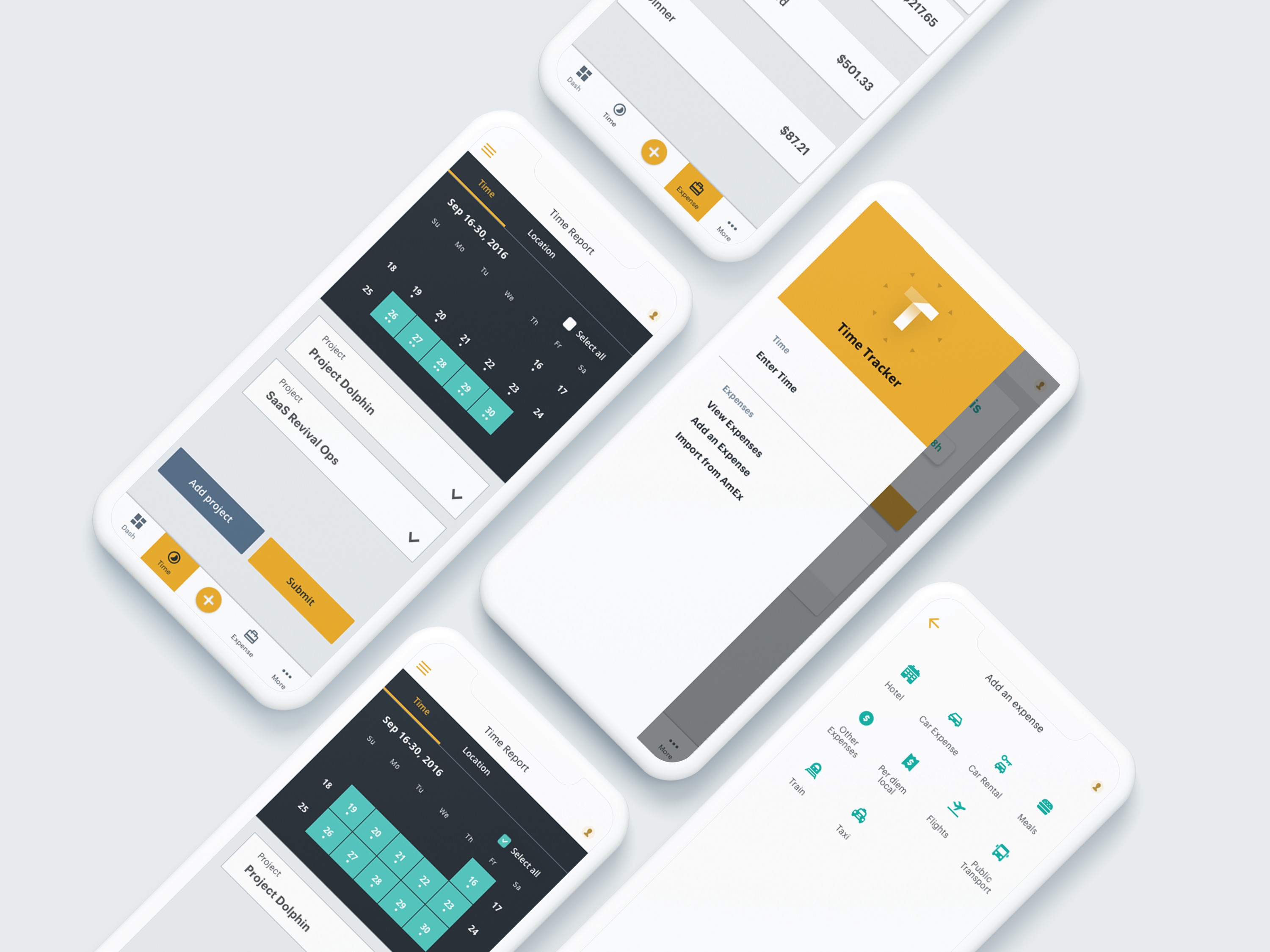
A mobile app for tracking hours worked and expenses charged to projects. As project lead, I helped the stakeholders come to clarity about their goals with a thorough intake process, and helped them summarize their key desires into two design principles:
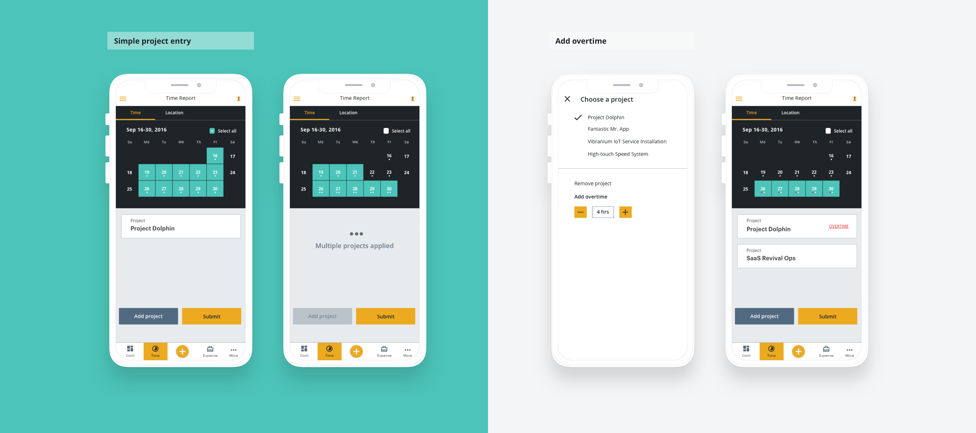
Automate as much as possible so that people could complete time reports on the go.
Deviate from the outdated enterprise look and elevate the experience.
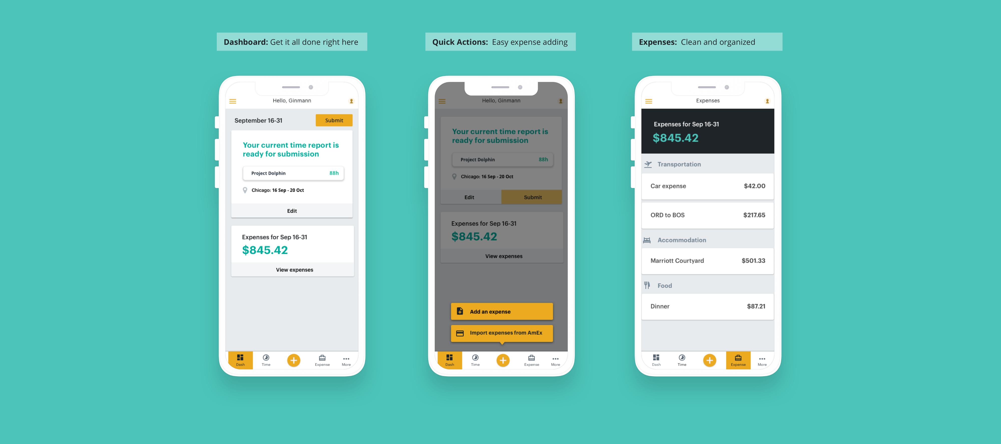
The time tracking app became the number one most used mobile app within the company.
We went through several iterations on time entry, trying different ways to indicate overtime and different colors for different projects, but at the end of the day we discovered that the more blunt indicators and interactions, that simply showed you whether there was a project assigned to the day or not, was the simplest interaction.
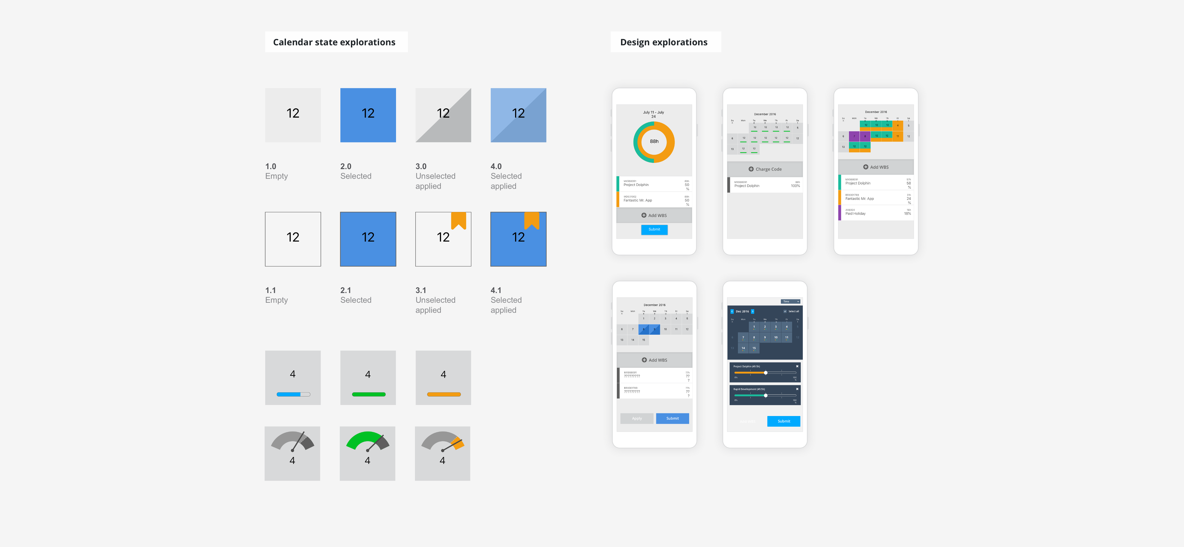
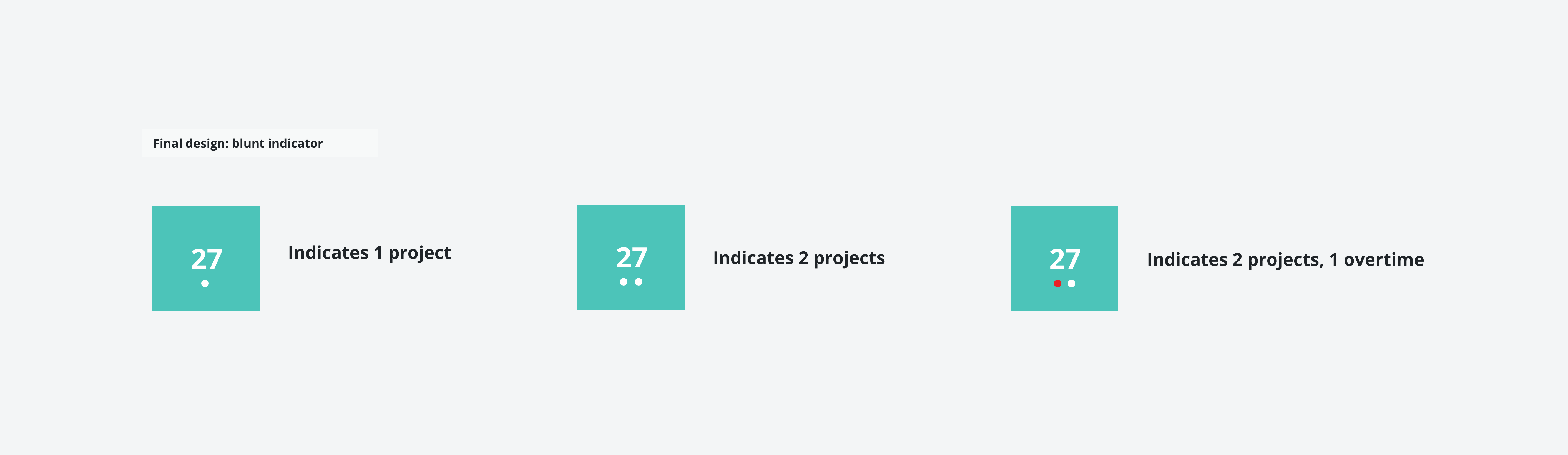
Don't overthink it.
A big temptation with design is over-engineering. It's easy to get caught trying to address every possible scenario, not realizing that sometimes the more blunt, “dumber” solution is the best way to go.
