My role: Lead Product Designer
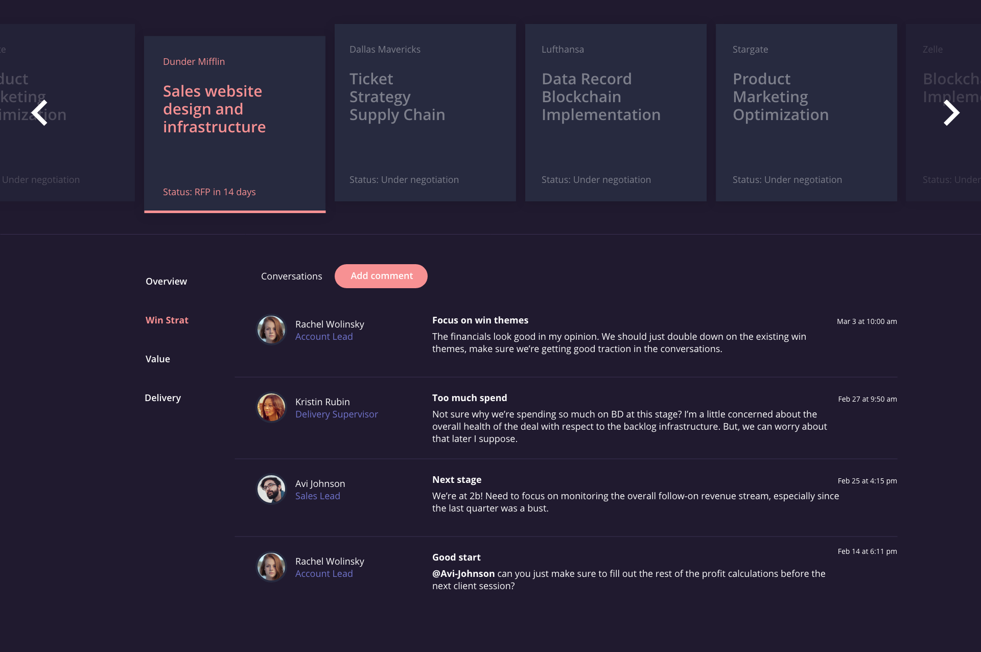
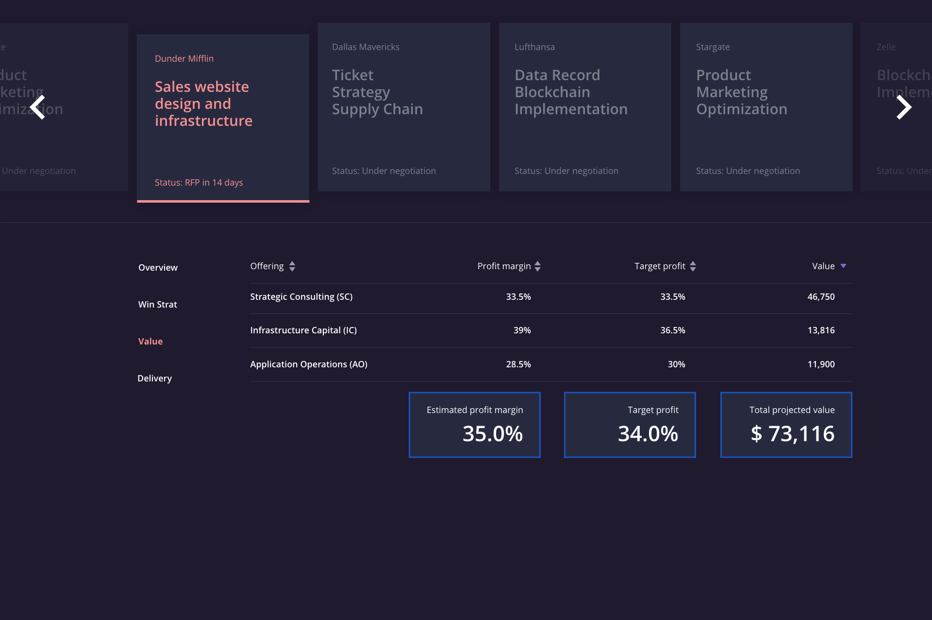
A dashboard for facilitating internal discussions about sales opportunities as they go from inception to contract signing.
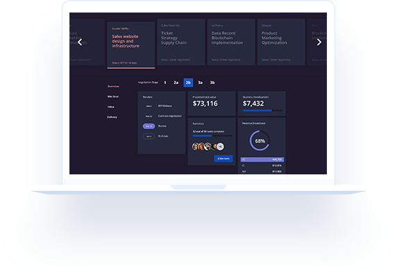
The company (name hidden) had a process for evaluating potential sales opportunities, which involved e-mailing PowerPoint decks back and forth, and no centralized source of truth.
The goal was to move all of the information that existed in PowerPoint decks into a standardized dashboard that everyone could view and have discussions. Dashboard would be built on top of Salesforce and provide real-time data.
We designed an efficient, visually stunning dashboard and successfully moved the process away from passing PowerPoint decks to each other and toward a modern solution.
The business stakeholders bristled at the idea of making this complicated tool minimal or simple. But being efficient, means that we only show what is needed to take action or move the discussion forward.

The previous version used colors liberally, which made extracting meaning very difficult. A muted UI palette, with a few accents, helped make this dashboard easy to read.

You don't need that many colors.
The key to great dashboard design is quantity of colors, but strategic use of color.
